
Elegant Christmas Card Ideas with Timeless Style
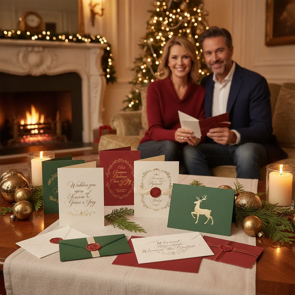
Quick answer: Elegant Christmas cards pair restrained colors, classic typography, balanced layouts, and thoughtful wording. Choose one strong focal point, such as a formal family portrait, a delicate botanical illustration, or a simple monogram. Premium paper, subtle foil, and coordinated envelopes can add polish without making the design feel crowded or overly ornate.
An elegant Christmas card feels intentional rather than elaborate. A limited color palette, generous spacing, and one carefully chosen visual can create more impact than layers of decorations. The strongest designs also match the sender’s personality, whether that means traditional greenery, formal photography, or quiet modern typography.
Use the following ideas as starting points rather than strict formulas. Each concept can be adapted for family cards, couple cards, business greetings, or personal notes.
Which color palettes make Christmas cards look elegant?
Classic color combinations are reliable because they connect naturally with the season. Deep forest green with cream feels traditional, while burgundy with soft gold creates a formal look. Navy with silver offers a cooler alternative that works especially well with winter landscapes and evening photographs.
Neutral palettes can also feel festive. Ivory, taupe, charcoal, and muted sage create understated cards that suit minimalist homes and sophisticated portraits. A single metallic detail can prevent a neutral design from feeling plain.
- Traditional: Forest green, ivory, and antique gold
- Formal: Burgundy, black, and champagne
- Wintry: Navy, white, and silver
- Natural: Sage, cream, and warm brown
- Modern: Charcoal, ivory, and copper
How can typography create a timeless Christmas card?
Typography often determines whether a card looks refined or busy. A graceful serif typeface works well for names and formal greetings. A restrained script can add warmth when used for only a few words, such as “Merry Christmas” or the family surname.
Pair no more than two type styles. A decorative script becomes easier to read when supported by a simple serif or sans serif typeface. Wide margins and generous spacing between lines help every greeting feel composed.
Which elegant card style suits each type of greeting?
| Card style | Best visual | Suggested wording |
|---|---|---|
| Traditional formal | Wreath, crest, or monogram | Wishing you a joyous Christmas season |
| Modern minimalist | Single photograph or line drawing | Peace, warmth, and joy |
| Botanical | Pine, holly, or mistletoe | Season’s greetings from our home to yours |
| Religious | Star, candlelight, or nativity detail | May the peace of Christmas be with you |
| Professional | Subtle border or winter landscape | Warm wishes for the holiday season |
What photo ideas feel polished rather than casual?
A formal portrait is not required, but the photograph should have controlled lighting, coordinated clothing, and a simple background. Outdoor portraits near evergreen trees, stone architecture, or a snow-covered landscape provide seasonal context without relying on props.
Choose clothing in related tones instead of identical outfits. Navy, cream, camel, burgundy, and dark green photograph well together. Avoid prominent logos and very small patterns, which can compete with the card’s message.
Black-and-white photography creates an especially timeless result. Pair a monochrome portrait with ivory paper, charcoal lettering, and a small gold accent for a card that feels both personal and formal.
Which design details add refinement without clutter?
Small production details can make a simple card feel special. Gold or silver foil works best on one element, such as a border, star, surname, or short greeting. Letterpress printing adds texture to typography and botanical illustrations without adding another color.
Thick matte paper supports understated designs and produces a substantial feel. Cotton paper has a soft, traditional texture, while smooth cardstock suits crisp photography. Rounded corners feel contemporary, but square corners usually appear more formal.
- Add a thin border around the card rather than several decorative frames.
- Use a monogram as a small accent instead of the main message.
- Repeat one botanical motif on the envelope flap.
- Select an envelope liner in a coordinating solid color or subtle pattern.
- Use white space to separate the photograph, greeting, and signature.
What wording works on an elegant Christmas card?
Elegant wording is warm, concise, and natural. Traditional greetings include “Wishing you peace and joy this Christmas” and “With warmest wishes for a beautiful holiday season.” A family card can close with “With love, the Bennett family” or list each first name beneath the main greeting.
Business cards should remain gracious without becoming too personal. “With appreciation and warm holiday wishes” recognizes the relationship while maintaining a professional tone. Religious cards can refer directly to faith when the message reflects the sender and the intended recipients.
How can handmade Christmas cards still look sophisticated?
Handmade cards look refined when materials and techniques are limited. Consider a cream card with a hand-stamped evergreen branch, a deckled paper panel with calligraphy, or a small watercolor wreath. Repeating one motif creates consistency across a full set.
Precise cutting and clean adhesive placement matter more than complicated decoration. A bone folder can produce crisp creases, while a paper guide keeps borders and wording aligned. Finish each card with a handwritten signature in black, navy, or metallic ink.
What limitations should you consider before choosing an elegant design?
Foil, letterpress, specialty paper, and lined envelopes can increase printing costs. Dark cardstock may also require special ink or a separate insert because standard pens are difficult to read on the surface.
Minimal layouts expose alignment, image quality, and spelling errors. Review the final proof at full size, check every name, and confirm that small text remains readable. Allow extra production time for custom printing and hand-addressed envelopes.
Best approach: Select one timeless color palette, one focal image, and one detail. A restrained design with personal wording will usually feel more elegant than a card filled with seasonal symbols.
When Elegant Christmas Card Ideas Feel Considered Rather Than Generic
Elegant Christmas card ideas look considered when a clear visual hierarchy, a restrained motif, and wording tailored to the recipient all support the same mood. Start with one defining choice—such as an engraved-style border, a winter botanical, or a formal portrait—then let secondary elements support it rather than compete. Repeat a small detail, such as a line weight or accent color, to make the composition feel intentional. Generic results often come from stacking familiar signals: script lettering, gold effects, snowflakes, and a stock greeting used together without a focal point. Remove anything that does not strengthen the central idea, and replace broad copy with a specific family name, year, place, or short personal sentiment. There is no objective number of colors, fonts, or ornaments that guarantees elegance; coherence matters more than a fixed formula.
Frequently asked questions
What makes a Christmas card look expensive?
Thick paper, balanced spacing, restrained colors, and one premium detail can make a Christmas card look expensive. Clean typography often has more impact than numerous decorations.
What is the most elegant Christmas color combination?
Forest green, ivory, and antique gold form a timeless combination. Navy and silver or burgundy and champagne offer polished alternatives.
Can an elegant Christmas card include multiple photos?
An elegant card can include multiple photos when the images share similar lighting and colors. A structured grid with generous margins keeps the layout orderly.
Should elegant Christmas cards use glossy or matte paper?
Matte paper generally produces a softer and more refined appearance. Glossy stock can be useful when vivid photographic detail is the main focus.
Are black Christmas cards appropriate?
Black Christmas cards can look formal when paired with white, gold, silver, or cream lettering. High contrast and uncluttered typography keep the greeting readable.
How should an elegant Christmas card be signed?
Use a short closing such as “With love,” “Warmest wishes,” or “With gratitude,” followed by names. A handwritten signature adds a personal finish to printed wording.
How do I make an elegant Christmas card feel personal?
Make an elegant Christmas card personal by adding one meaningful detail while keeping the overall design restrained. Use a short note that reflects the year, a photograph from a significant setting, or a subtle motif connected to your family. Personalization feels polished when it has a clear purpose rather than appearing as extra decoration.
Can a minimalist Christmas card still feel festive?
A minimalist Christmas card can feel festive through carefully chosen seasonal cues. A single evergreen branch, star, candle, ribbon, or winter scene may be enough when paired with generous space and concise wording. Use one warm or traditional accent color so the card reads as Christmas-focused without relying on a crowded collection of holiday symbols.