
Elegant Minimalist Christmas Card Ideas for Sophisticated Holiday Style
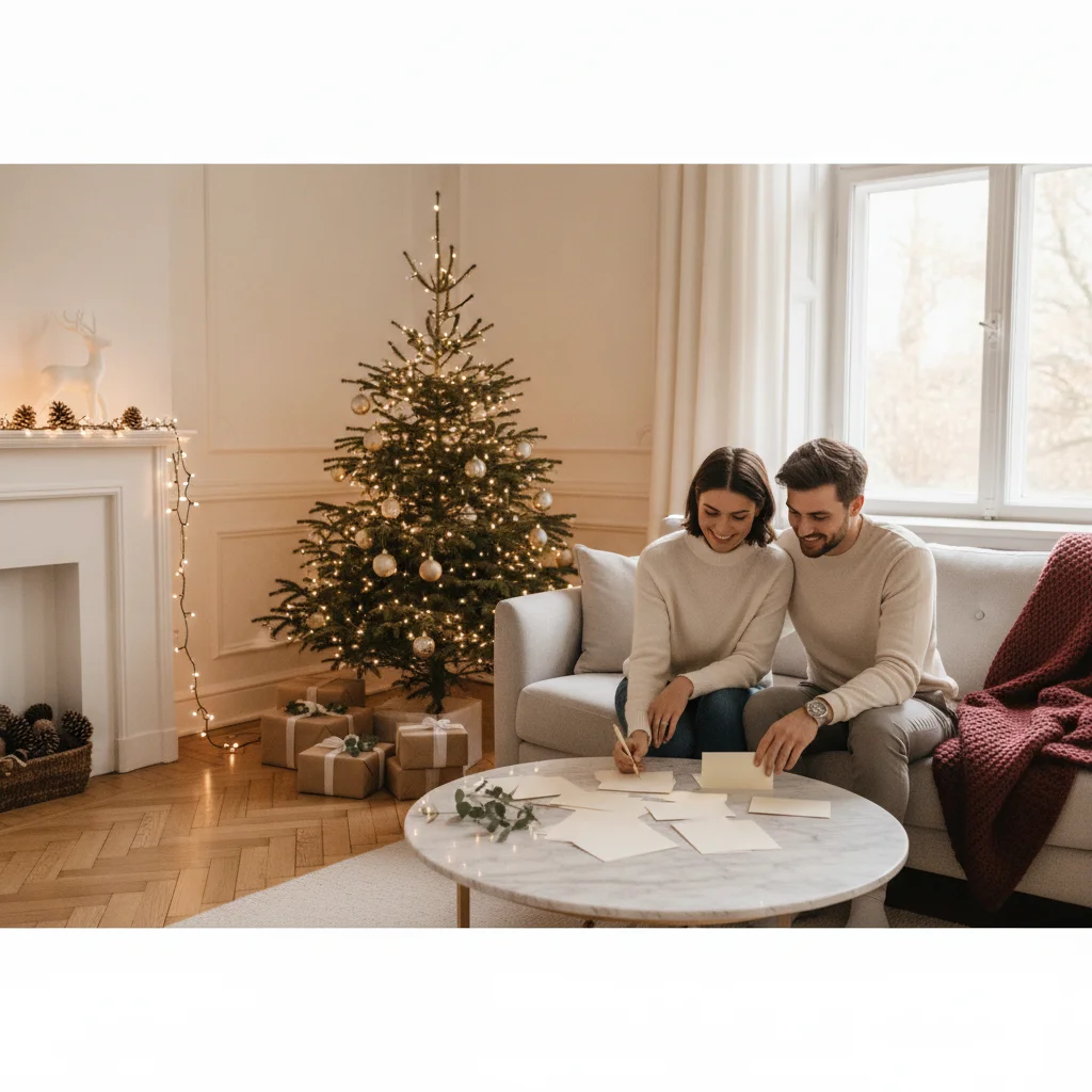
Quick answer: Elegant minimalist Christmas cards combine generous white space, refined typography, restrained colors, and one carefully chosen festive detail. Try a delicate line drawing, a small foil star, an understated family photo, or a short greeting on premium paper. Limiting the design to two fonts and two or three colors keeps the result polished.
A minimalist Christmas card does not have to feel plain or unfinished. The strongest designs use restraint intentionally, giving each word, image, and material enough room to make an impression.
Elegant cards often rely on one focal point rather than a collection of competing decorations. A tiny evergreen sprig, carefully placed photograph, or beautifully typeset greeting can communicate the season without crowded borders or busy patterns.
Which minimalist Christmas card ideas look most sophisticated?
Start with a concept that can be understood at a glance. These ideas suit printed cards, handmade designs, and digital greetings:
- Single botanical sprig: Place a fine-line fir, eucalyptus, or holly illustration above a short greeting.
- Centered serif message: Set “Merry Christmas” or “Peace and Joy” in an elegant serif typeface with generous spacing.
- Tiny metallic star: Add one gold, silver, or copper star to an otherwise unadorned card.
- Monochrome landscape: Use a simple ink drawing of snow-covered trees, hills, or a quiet cottage.
- Small family photograph: Give one image a wide white or cream border instead of filling the entire front.
- Embossed symbol: Press a wreath, snowflake, tree, or monogram into thick paper without adding color.
- Modern initial design: Pair the family initial with a discreet date and concise seasonal message.
- Minimal ornament silhouette: Suspend one simple ornament shape from a thin vertical line.
Which colors create an elegant minimalist look?
Restrained palettes help minimalist cards feel intentional. Choose one neutral foundation, one primary color, and an optional metallic accent.
| Palette | Best suited to | Suggested accent |
|---|---|---|
| Ivory and forest green | Classic botanical cards | Soft gold |
| White and charcoal | Modern typography | Silver |
| Warm beige and burgundy | Traditional understated style | Copper |
| Navy and cream | Winter skies and stars | Gold |
| Blush and deep red | Soft contemporary designs | Rose gold |
Pure black and bright white can feel crisp and architectural. Cream, stone, and muted green create a softer result. If you use metallic foil, treat it as a focal detail rather than another background color.
How can typography make a simple card feel luxurious?
Typography carries extra visual weight when a design contains few illustrations. A high-contrast serif font offers a formal look, while a clean sans serif feels contemporary. A restrained handwritten script can add warmth when used for only a name or two-word greeting.
Limit the design to one or two typefaces. Adjust letter spacing and line spacing before adding more decoration. Small uppercase lettering can work well for dates, locations, family names, or a quiet secondary message.
Avoid placing every sentence in ornate script. Longer script passages can become difficult to read and may make a restrained design feel cluttered.
How should a photograph be used in a minimalist card?
Choose one strong photograph with a calm background, balanced lighting, and room around the subjects. Neutral clothing and natural settings usually fit minimalist layouts better than complex props or heavily themed scenes.
A small rectangular, square, or circular photograph can sit above a simple greeting. Another option is a full-bleed black-and-white image with a narrow text band. Skip decorative frames if the photograph already has a clear composition.
Photo editing should remain subtle. Correct exposure, crop distracting edges, and keep skin tones natural. Heavy filters can date the design and compete with its understated character.
Which paper and finishing details add elegance?
Material choices are especially noticeable when a card has little ornamentation. Thick uncoated stock, lightly textured cotton paper, or smooth matte paper can provide a tactile sense of quality.
Letterpress, blind embossing, and foil stamping add depth without requiring a complex layout. Rounded corners offer a softer contemporary finish, while crisp square corners feel formal. A matching envelope in cream, kraft, muted green, or deep navy completes the presentation.
For handmade cards, use a metal ruler and sharp craft knife for clean edges. One precisely tied thread, pressed leaf, or wax seal is usually more effective than several layered embellishments.
What should an elegant minimalist Christmas message say?
Short messages suit restrained designs, but the wording should still feel personal. Consider “Peace and joy,” “Warm Christmas wishes,” “Merry and bright,” “With love this Christmas,” or “Wishing you a quiet and joyful season.”
Inside the card, add one specific sentence about the recipient or the past year. A handwritten note prevents a simple printed design from feeling impersonal.
What limitations should you consider with minimalist cards?
Minimal layouts expose small mistakes. Uneven alignment, low-resolution photographs, weak printing, and awkward spacing are more visible when there are few other elements.
Some recipients may interpret an extremely sparse card as impersonal. A warm interior message, signature, or personal photograph can correct that impression. Metallic foil and specialty printing may also increase cost, so a beautiful typeface and high-quality standard paper can be better choices for a large mailing list.
Best overall approach: Choose one seasonal symbol, one concise greeting, and one refined material detail. Leave generous space around every element, then add personality through the handwritten message rather than extra decoration.
When do elegant minimalist Christmas card ideas feel considered rather than generic?
Elegant minimalist Christmas card ideas look considered when each restrained choice reflects a specific recipient, photograph, or family detail; they look generic when simplicity removes all evidence of intent. Start with one distinctive anchor, such as an unusually cropped winter photograph, a small hand-drawn motif, or a greeting written in your family’s natural voice. Repeat one subtle detail—perhaps a line weight, monogram shape, or accent color—to create visual logic. Avoid default-looking combinations of centered text, stock greenery, and an impersonal seasonal phrase unless one element has personal meaning. Check whether removing any detail makes the card clearer; if not, that detail may be decorative rather than purposeful. There is no objective number of elements that guarantees sophistication, so judge the design by coherence, specificity, and balance instead.
Frequently asked questions
What makes a Christmas card look minimalist?
A minimalist Christmas card uses generous empty space, limited colors, restrained typography, and one clear focal element. Every detail serves a specific visual or personal purpose.
What colors work best for an elegant Christmas card?
Ivory, forest green, navy, charcoal, burgundy, and warm beige create refined palettes. Gold, silver, or copper works best as a limited accent.
Can a minimalist Christmas card include a family photo?
A single well-composed family photo works well when paired with a simple border and concise greeting. Calm backgrounds and natural editing support the understated style.
Which fonts suit sophisticated Christmas cards?
High-contrast serif fonts feel formal, while clean sans serif fonts create a modern look. A subtle script is most readable when reserved for a short greeting or family name.
How many design elements should a minimalist card have?
One primary motif, one greeting, and one optional accent are usually enough. Additional elements should be removed if they compete for attention.
How can I make a simple card feel more personal?
Add a handwritten note, family signature, meaningful date, or small photograph. Personal wording creates warmth without adding visual clutter.
Do minimalist Christmas cards cost more to print?
Standard minimalist cards can be affordable because they use fewer colors and graphics. Foil, letterpress, embossing, and thick specialty paper can increase printing costs.
How do I keep a minimalist Christmas card from looking empty?
Give the open space a clear relationship to one focal element. Place a short greeting, photograph, or small illustration deliberately off-center or within a defined alignment, then use spacing to guide the eye toward it. Empty space feels intentional when margins, text placement, and scale follow a consistent visual structure.
Should elegant minimalist Christmas cards use traditional holiday symbols?
Traditional symbols are optional, but one restrained symbol can establish the Christmas context without clutter. Choose a simplified star, branch, bell, candle, or snowflake and avoid combining several unrelated motifs. A symbol feels more considered when its shape, color, or meaning connects with the card’s message or photograph.